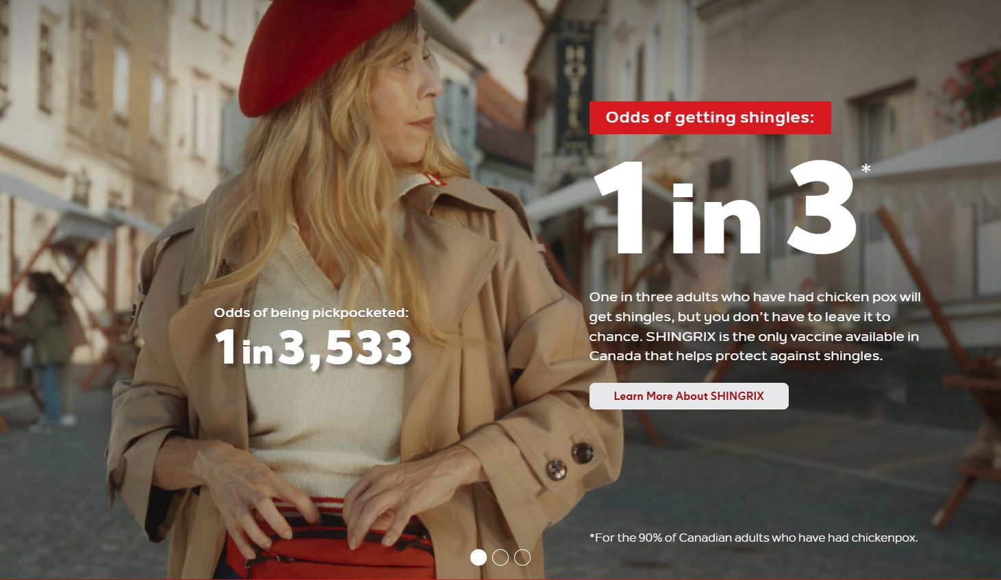
SHINGRIX is a vaccine that helps prevent shingles in older adults. The website needed to serve them as well as family members and caregivers helping them find reliable information and next steps.
GSK partnered with Edelman Canada to redesign the experience with easier-to-digest copy and clearer visuals, helping visitors understand and recall key facts, explore supporting details, and find a nearby vaccination location.
Problem
The initial website contained excessive information formatted in a way that was confusing, overwhelming, and hard to use. Users were bombarded with text and did not know how to make an appointment to get the vaccine.
Design goals
Review the new design concepts and clarify what each experience should help users do.
Create consent, task, success, and failure parameters for the user-testing sessions.
Write interview and questionnaire prompts that test navigation, comprehension, and recall.
Keep the older target audience central throughout the design review and testing process.
Solution
The design team used my documentation to write the questionnaire and testing plan. Users then tested the Figma high-fidelity mockup by finding actions such as Get SHINGRIX and the FAQ, recalling information from the landing page, and giving overall feedback.
The updated website introduced clearer user flows, more visuals, shorter-form information, and clearer ways to find the vaccine in medical clinics.
Before and after
Each comparison follows a user task from the testing process: find the information, understand it, and know what to do next.
Before redesign
Understand shingles symptoms
Long scrolling hid key details.
Dense copy buried the main facts.
Few visuals broke up the text.
Next steps were easy to miss.
↓After redesign
Understand shingles symptoms
Short facts surface key information.
Expandable details add depth on demand.
Visuals clarify the content.
Clear indicators guide next steps.
Before redesign
Find vaccine info and next steps
A question grid made FAQs hard to scan.
Answers sat apart from the main experience.
Vaccine actions were easy to miss.
↓After redesign
Find vaccine info and next steps
Grouped FAQs make answers easier to scan and understand at a glance.